Romania Diploma Formats: Similar Layouts, Different Academic Records
Place two Romanian university certificates beside each other, and their overall structure may look surprisingly familiar. Yet a Romania diploma represents a particular institution, qualification and graduate. The accompanying Diploma Supplement can provide context that the main certificate does not show. Before comparing background colours or page layouts, it helps to understand why similarities exist and where a visual comparison stops being useful.
Why Different Universities May Use Similar Formats
A university diploma is more than a piece of institutional stationery. Romania has national rules covering the content and format of higher education awards.
For example, Government Decision No. 1,225/2024 approves formats for several qualification types and the Diploma Supplement. Its stated scope concerns students entering their first year from the 2024–2025 academic year.
That shared framework offers a plausible explanation for similarities across institutions. However, it does not establish that every Romanian university has always used identical stationery. Nor does it prove that differences between two photographs reflect university preferences.
The distinction between entry year and graduation year matters here. A format rule for a particular intake does not necessarily describe every certificate issued in the same calendar year.
Therefore, a page labelled “latest Romania diploma” needs more context. Which qualification does it show? Which institution issued it? What do we actually know about the relevant study period?
What a Small Sample Collection Can Tell You
A collection covering two or three universities provides a useful starting point for observation. It can reveal recurring page structures or visible differences between the documents in that collection.
However, it cannot establish a complete national catalogue.
A careful description might say that two available samples share a similar arrangement of text. It might also note that their backgrounds appear different. Those observations remain tied to the specific images.
A stronger claim—such as “this university always uses this colour”—requires evidence across relevant years and awards. Without that evidence, the claim goes beyond what the sample shows.
This approach also makes sample articles more useful. Readers can distinguish a direct observation from an assumption, rather than treating every caption as a verified rule.
Background Colour Is Only Part of the Picture
A pale background can look warmer in a photograph than it does on paper. Scanner settings, lighting and image compression can also affect its appearance.
Consequently, two online images may look different even when the underlying documents share similar printing. Conversely, low-quality photographs may hide differences that a person could see in the originals.
Before drawing conclusions, ask whether you are comparing like with like. A cropped phone photograph and a flat scan do not provide equivalent visual evidence.
Dates need similar care. The date someone uploaded a picture does not establish the date of the certificate. Likewise, a filename containing a year does not confirm that year unless the document or a reliable record supports it.
For a sample collection, record uncertainty openly. “Year unconfirmed” gives a reader more useful information than an invented date.
What About Stamps and Embossed Seals?
A stamp or embossed impression may attract attention when comparing documents. Nevertheless, an image of such a feature cannot confirm the award behind it.
Different photographs may show the same impression with very different clarity. A visible mark also does not establish who applied it or whether the document matches university records.
For that reason, sample descriptions should avoid presenting a seal as a stand-alone authenticity test. Keep the discussion observational and leave credential verification to the issuing institution or the appropriate receiving organisation.
Commemorative artwork needs a separate approach. It should visibly identify its non-official purpose and avoid reproducing institutional authentication features. A decorative design can acknowledge a graduation without imitating an official credential.
University of Bucharest: A Specific Example
The University of Bucharest, known in Romanian as Universitatea din București, provides a useful historical focus for this subject.
Prince Alexandru Ioan Cuza established the university in 1864 by bringing together the faculties of Law, Sciences and Letters. Its broader educational heritage reaches back to the Academy of Saint Sava, founded in 1694.
These dates describe different stages of institutional history. The earlier academy provides historical context; 1864 marks the establishment of the university itself.
This distinction matters when writing about an old document. A university’s long history does not mean that one certificate layout has remained unchanged throughout that history.
Use the institution’s full name when identifying a sample. “Bucharest diploma” alone is too broad, since a city name does not uniquely identify an awarding university.
Read the Qualification Before Comparing the Design
The word “diploma” covers several different awards. A bachelor’s qualification, an engineering award and a master’s qualification do not become equivalent because their certificates share a similar layout.
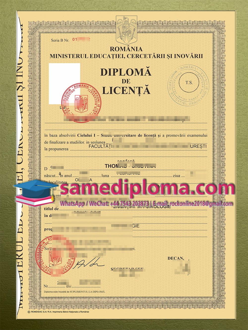
Romanian titles such as “Diplomă de licență,” “Diplomă de inginer” and “Diplomă de master” identify different award categories. Preserve the wording of the actual document when describing it.
For an English-language article, explain unfamiliar terminology in the surrounding text. Do not silently replace the original award title with a qualification that sounds more familiar.
The same principle applies to the university name. Retaining Romanian spelling, including the diacritics in “București,” helps maintain an accurate reference.
If a receiving organisation needs a translation, ask what form it accepts. A website caption or an informal English description does not automatically meet its requirements.
Choosing Between a Digital Archive and a Display Piece
For personal records, start with documents you own or have permission to handle. Keep a complete, untouched scan before creating any edited viewing copies.
A digital archive should preserve academic facts. Cropping unnecessary space or rotating a page can improve usability, but changes to names, results or qualifications alter the record itself.
A display piece has a different purpose. It may celebrate a graduation, accompany a family history collection or serve as a clearly fictional stage prop. Its design should make that purpose visible.
Before commissioning artwork, decide whether you need a digital file, a printed piece or both. Explain the intended setting and agree on the wording. There is no reason to purchase printing when a digital-only project meets your needs.
If you need an official replacement, contact the university instead. Ask about its current procedure rather than assuming that an old graduation date makes replacement impossible.
Making a Sample Page Worth Reading
A useful Romania diploma article should tell readers something specific about the example on the page. Start with the institution and document type, then explain any known historical context.
Keep observations narrow. Describe what you can actually see, acknowledge uncertain dates and avoid claims that extend beyond the available evidence.
Where permission allows publication, conceal personal identifiers in a separate public image. Preserve the unedited private file rather than overwriting it.
Finally, give the image an accurate description. If it shows a University of Bucharest document, identify that university instead of labelling it as a universal Romanian format.
Similar layouts make an interesting starting point. The more valuable story lies in the differences between institutions, qualifications and periods—and in knowing which of those differences the evidence can actually support.